Travel has become too convoluted. Customers are frustrated with booking too many parts of their travel through different apps with reservations in many different locations. They want to spend their limited budgets on activities and cultural experiences rather than splurge on flights and hotels.
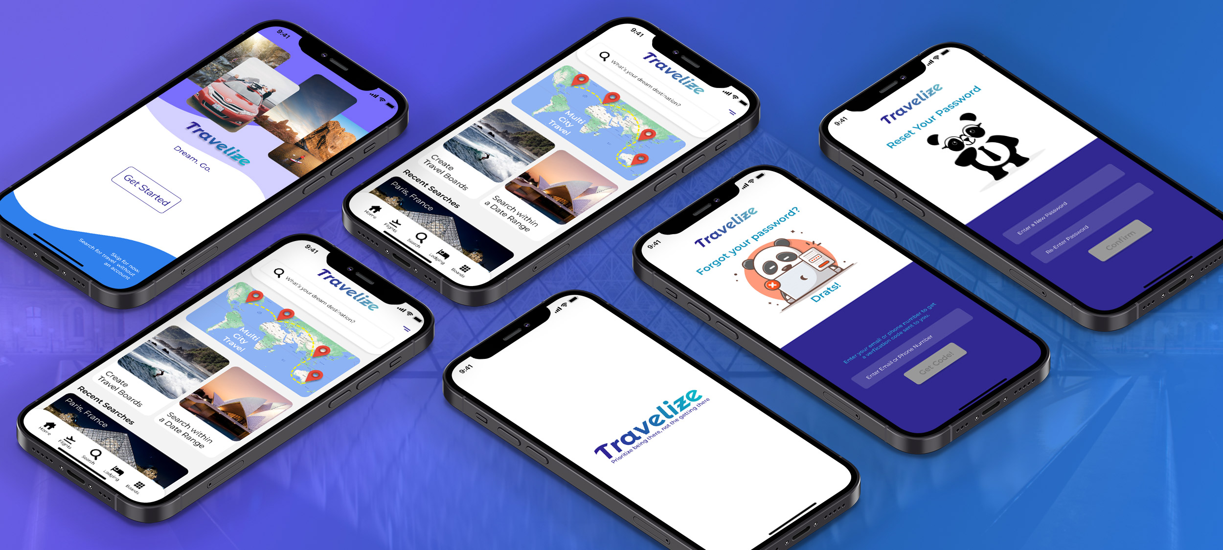
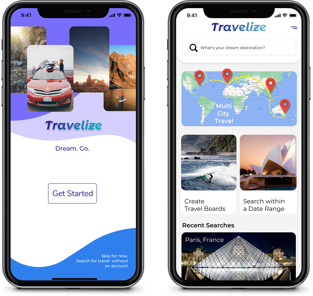
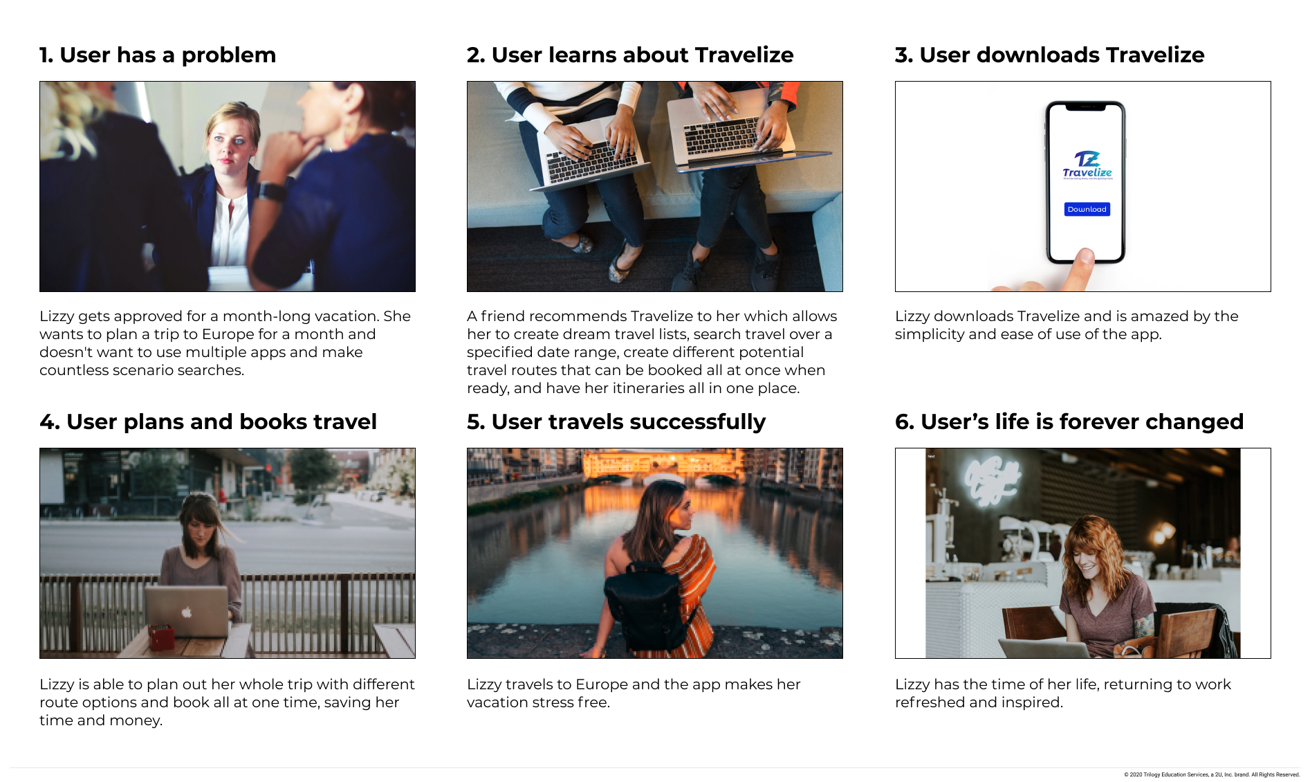
Travelize prioritizes rich cultural experiences over fancy hotels and flights with a quick and easy reservation experience, beginning to end. We make it easy to change plans inside the app, avoiding the need to ever call customer service.
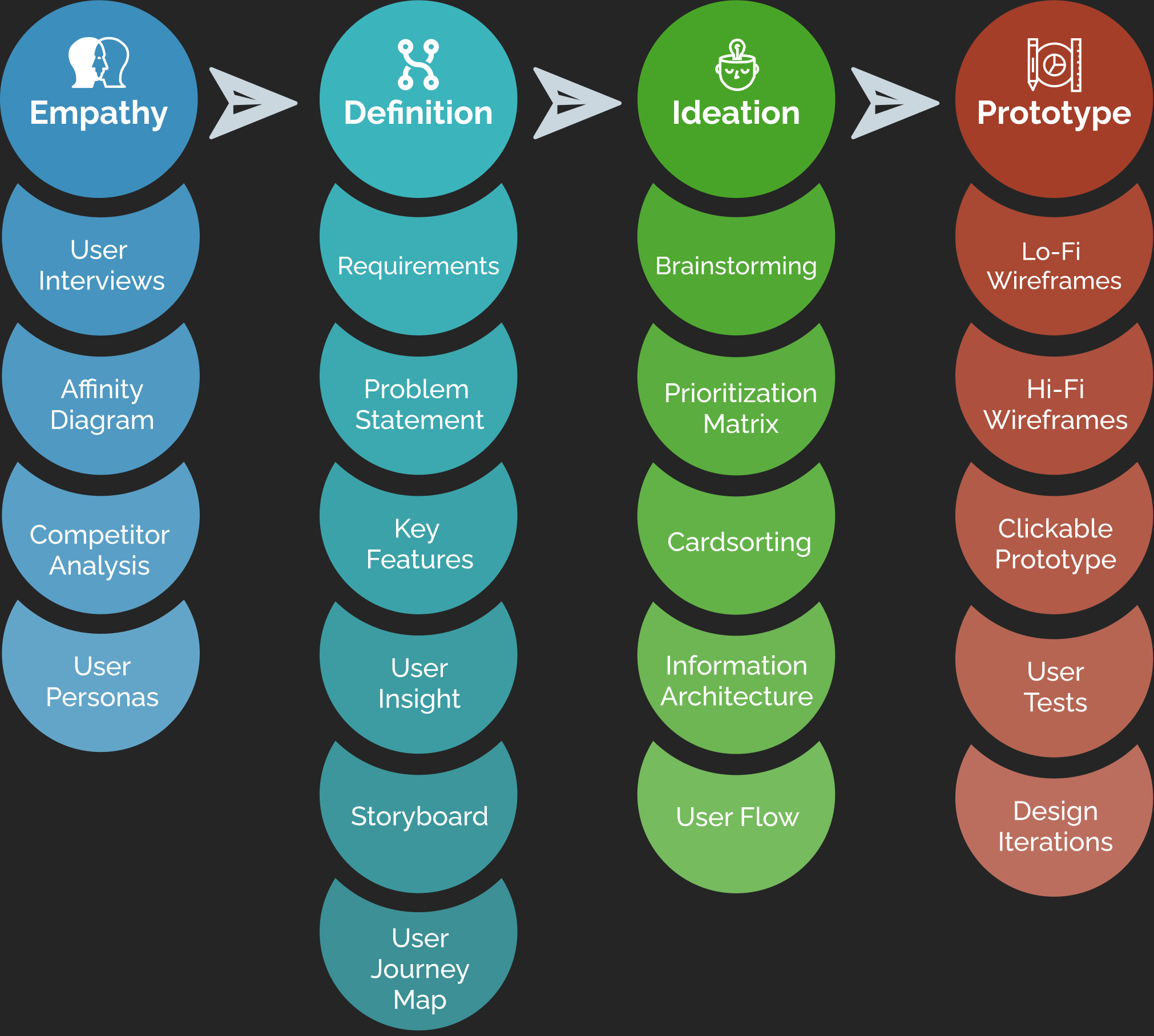
I collaborated with another UX designer on the empathy, definition, and ideation phases of the project, then I planned, wireframed, and prototyped the UI.
Through the Design Process, we were able empathize with potential users, define the user flows and key requirements, brainstorm new ideas, and prototype a new design.
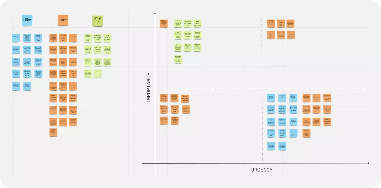
For this project, we created a proto persona as well as planned and conducted 5 interviews with potential users throughout the United States. From this, we were able to create an affinity diagram and an empathy map that led us to our User Personas.

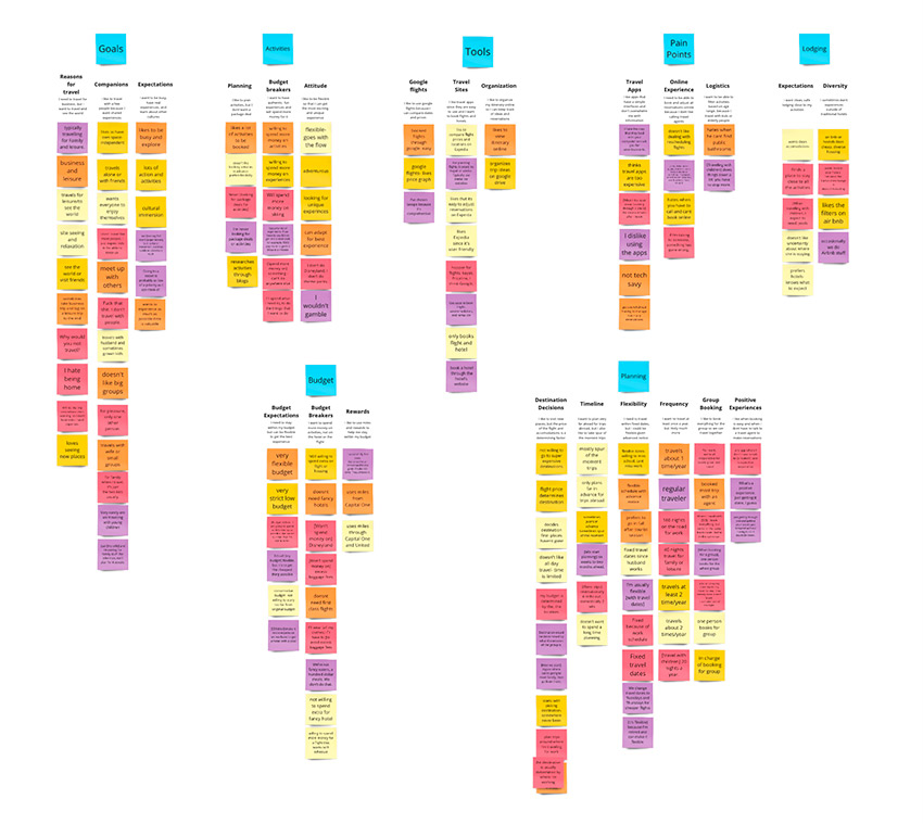
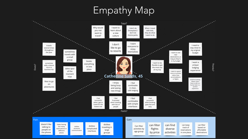


During our research & user interviews, we found that people are frustrated with travel booking websites and apps. They want to be able to plan multi-destination travel, book all parts of travel within one app, have all their plans and info in one place and experiences within one app, and never want to have to talk to a human.
We think that Travelize can streamline the travel booking experience, simplifying the process while providing better search, planning, and information retrieval options.
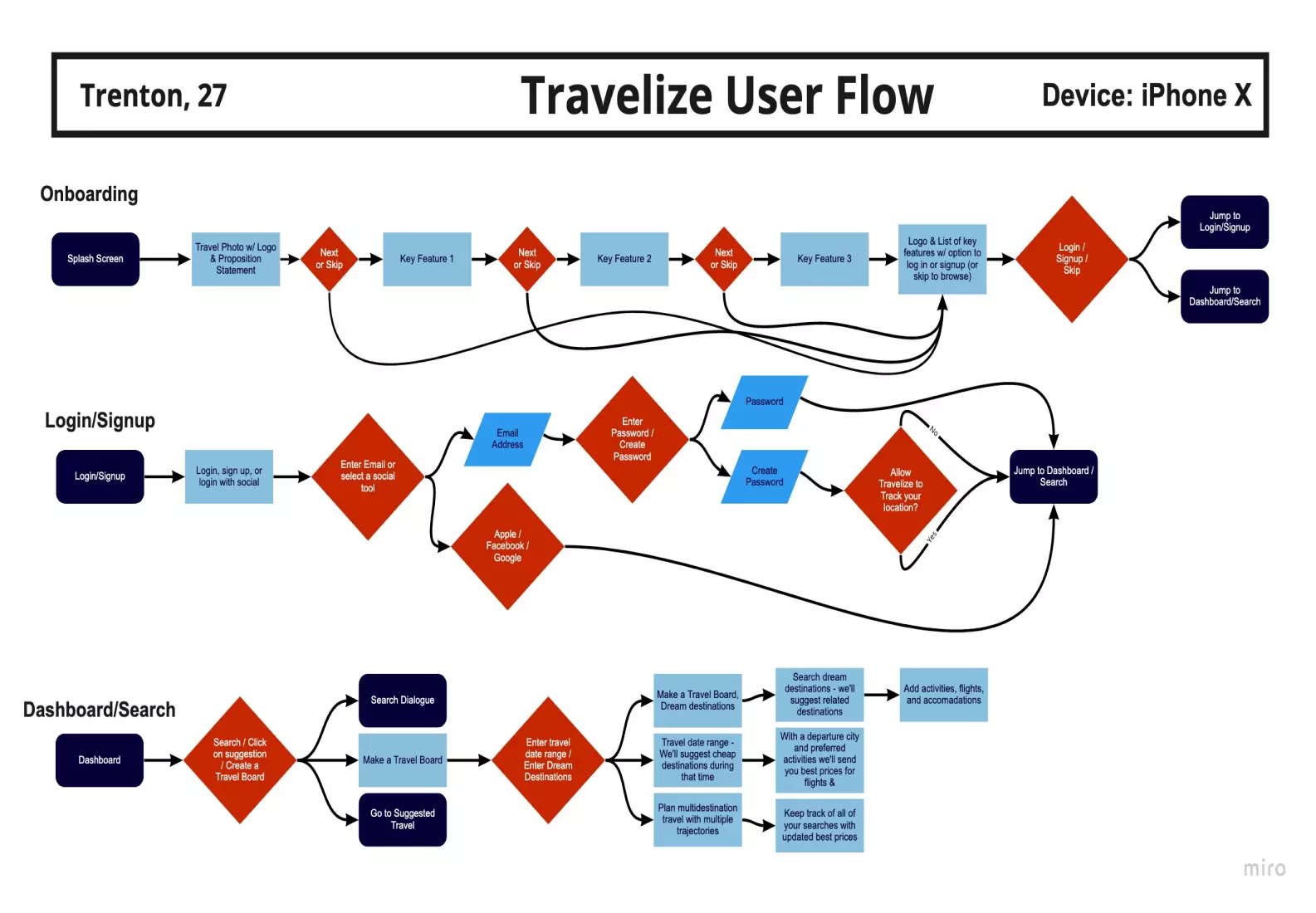
Wireframing the layout was important to my process, visualizing where elements were going to be and how the site would be mapped. In the lo-fi stage, I can concentrate on ideas without getting stuck on colors, fonts, and exact details.
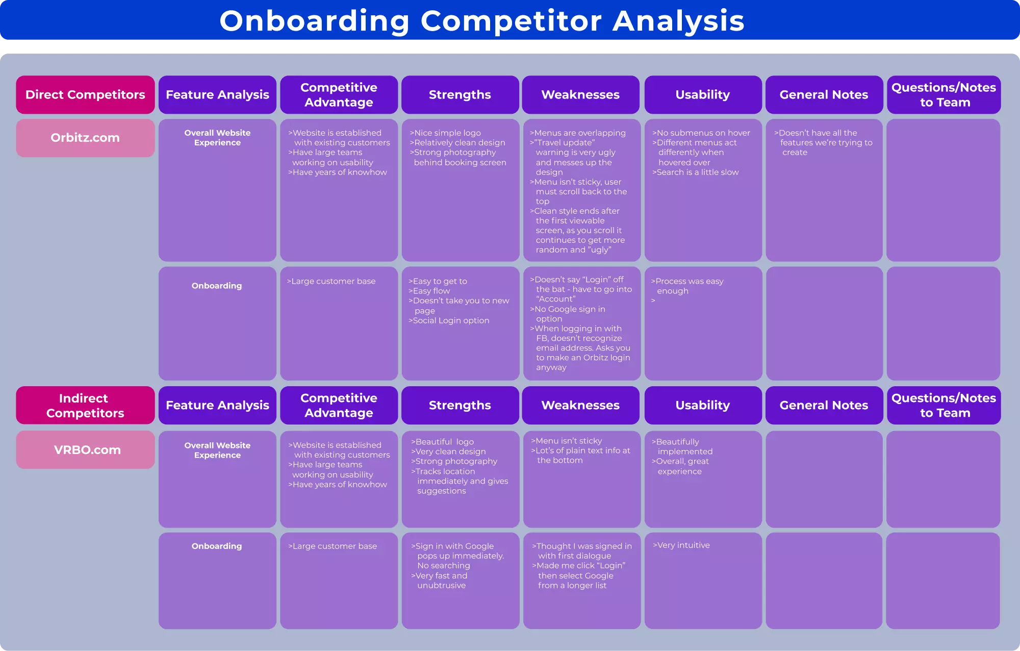
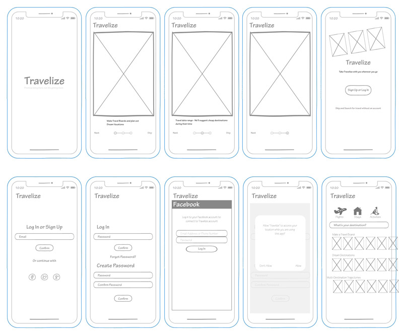
From the lo-fi wireframes, I created medium-fi prototypes that were guerrilla user tested. The feedback gave me great insights into where users were having blocks with the app. Some important revelations were: